Best Colors to Wear for Beach Photos: A Guide from Your Cabo Photographers
If you’re asking yourself, “What colors should I wear to my beach photoshoot?” well done! Seriously, you’re a giant step ahead of most.
Choosing your outfit colors can completely change the mood and look of your photos, maybe more than anything else. The colors you wear can bring out the best in your surroundings, or clash with them. They can take a dreary day and make it pop, or a golden hour and dampen the mood.
Here at Cabo Family Photos, our photography style leans toward a watercolor, pastel, dreamy aesthetic:
Airy neutrals, playful turquoise, sunset pinks, and warm golden tones.
These colors don’t just look pretty — they work with Cabo’s natural light to create images that feel romantic, joyful, and maybe even a little whimsical.
Let’s break down how to choose your perfect beach photo palette.
1. Choose Your Beach Color Schemes


One of my favorite tips is to look at what the beach is already giving you.
The soft, beige sand
The aqua-to-deep-blue water
The dreamsicle peachy-pink tones at sunset
If Cabo San Lucas is the canvas, these colors are the paint. And your outfits should complement that, not compete.
For example:
A pale blush dress looks dreamy against the cool blues of the ocean.
A soft sage green shirt picks up the tones of beach grasses or palm trees.
Cream, ivory, and warm beige blend beautifully without washing you out (especially if you’ve been catching sun).
The key to timeless photos are colors that feel like they belong in their natural surroundings.
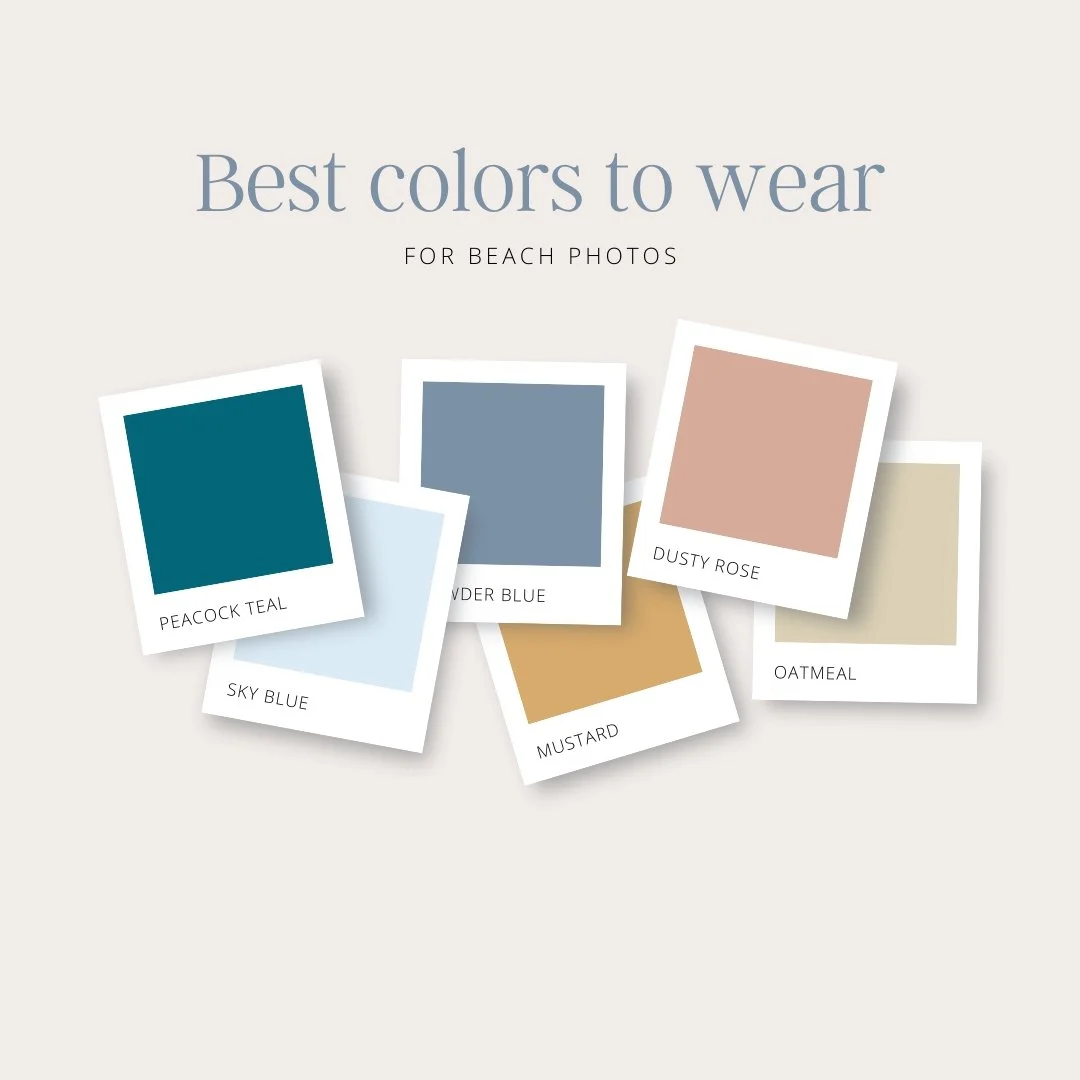
2. Choose Light, Muted Tones Over Bright, Saturated Ones
Our editing style leans dreamy and watercolor. Don’t get me wrong—we can punch up the bold and bright when needed, and we love a dramatic golden hour. But if you want something that will feel timeless, try:
Soft blues (powder blue, dusty blue, teal)
Muted pinks (blush, dusty rose)
Warm neutrals (sand, cream, champagne, oatmeal)
Pastel greens (sage, eucalyptus)


You see how these colors look amazing against the beach, whether in the middle of the day or at sunset? These tones create that watercolor feel we love. They also reflect light beautifully, which helps skin tones look natural and flattering.
(And while we’re on the subject of skin tone, we’ve had so many clients forget to re-apply sunscreen during their vacation and come to the shoot stressed a sunburn might ruin the photo op. Please don’t worry! We completely understand and have an edit for that. 😉)
3. Coordinate, Don’t Match

If you’re taking family or couple photos, try this: pick two or three main colors for everyone to pull from. This avoids the “matching T-shirt” look while keeping your group visually connected.
Example Cabo beach palette:
Dusty blue
Warm beige
White or ivory
And when incorporating prints or patterns, the rule of thumb is to use no more than one pattern for every two solids.
That means if one person wears a pattern, no one else in the group should wear a pattern unless two others are wearing solid colors. This isn’t an exact formula, but people seem to love photos with that type of mix.
Here’s how that might look:

Mom in a flowy dusty blue maxi dress (Example: Old Navy)
Dad in a white linen button-up with khaki pants (Example: J. Crew)
Daughter in a blush cotton or gauze romper with a beige sunhat (Example: J. Crew, Target)
Son in a light blue short-sleeve shirt and tan shorts (Example: Old Navy)
The colors tie together without feeling forced, and the mix of textures adds depth to the photos.
4. The Magic of White and Ivory
If you really want the Cabo backdrop to pop, well, white and ivory are iconic beach photo colors for a reason. They feel light, airy, classic. In Cabo’s golden light, white reflects the sun and makes your skin glow.

The key is to mix your whites:
Pair a crisp white shirt with soft ivory linen pants.
Combine a lacy white dress with a champagne cardigan.
Layering keeps the look from feeling flat and makes the whites photograph more like warm highlights than stark pops.
5. Think About Movement

Color is important, but so is texture and flow. The beach is breezy — and we want to use that to our advantage.
A pale peach chiffon dress catching the wind will create a soft blur of color in your photos. Linen pants in warm sand tones ripple just slightly with the ocean breeze.
This movement adds life and softness to your images, making the colors feel even more dynamic.
6. Avoid These Color Pitfalls
Listen, your personal style matters above anything I say here. But there are a few colors I recommend skipping for beach photos:
Pure black – A heavy black will compete with Cabo’s bright, light feel. Black also loses detail in bright sunlight.
Navy or royal blue – Often blends into shadows and loses depth against the blue ocean.
Bright red – Can reflect onto skin, creating unwanted color casts.
If you love a bold color, try incorporating it in a subtle accessory (like a scarf or earrings) rather than as your main outfit. Which brings me to…
7. Accessorize in Complementary Colors


Your accessories can tie your whole look together:
Straw hats and woven bags add texture and neutral tones.
Bright or bold sunglasses can make for a fun burst of photos.
Soft pastel hair ribbons or wraps add a romantic touch.
Gold jewelry warms up cooler tones and glows in sunset light.
Treat your accessories as little exclamation points to your color story!
8. How Color Impacts the Mood of Your Photos

Color isn’t just about coordinating with the background — it shapes how your photos feel. For example:
Light blues + whites → Serene, calming, and classic
Peach + blush → Romantic, soft, and feminine
Sage + beige → Earthy, natural, and warm
Champagne + dusty rose → Elegant and timeless
This might sound cheesy, but as Cabo San Lucas photographers, we truly think about your colors as part of your overall story. The shades you wear help us tell it.
9. Bringing It All Together
If you remember nothing else, remember this: choose colors that work with the beach, not against it.

The best colors to wear for beach photos are those that:
Complement Cabo’s sand, sea, and sky
Are light, muted, and timeless
Coordinate without being matchy-matchy
You feel comfortable in
Whether it’s a sunrise maternity shoot, a sunset family session, or a romantic anniversary stroll along the water, your outfit colors set the tone for how your photos will feel decades from now.
Ready for Your Dream Beach Session?
At Cabo Family Photos, we specialize in creating timeless, crisp, watercolor-style images that feel like memories you can step back into. We’ll guide you on everything — from the best colors to wear for beach photos to the perfect time of day for the dreamiest light.
Bring your barefoot joy, your flowing fabrics, your precious smiles — we’ll take care of the rest!
📷 Book your Cabo beach photoshoot today and let’s create images you’ll treasure forever.